Case study

Scout: competitive UX intelligence in your browser

A tool that makes competitive analysis as fast as opening a new tab. Scout is a Chrome extension that reframes “what’s broken” into what you can learn from any competitor site, with Gemini-powered insights, on-page annotations, and a report you could hand to a client.

Chrome Extension JavaScript Gemini API 2-day sprint
2 days From concept to shipped extension, then through Chrome Web Store review to a public listing.
<10s Full competitive read on a typical marketing page, end to end.
5 stars Public Chrome Web Store review within hours of launch.

My role

Product designer and developer: positioning, UX writing, UI, extension architecture, Gemini integration, annotations, tooltips, and PNG report export.

Get Scout on the Chrome Web Store →

5-star Chrome Web Store review within hours of launch -- the first external user called it ‘incredibly useful for anyone involved in product, UX, or competitive analysis.’

Origin

Why I built it

I wanted a Chrome extension for three reasons: I wanted a piece of work that lived outside slides and demos, I wanted to learn how to ship something real, and, most importantly, I wanted a tool like this to exist.

I knew from the start I wanted to build something in the UX space. Not because it was safe, but because I saw a gap. Every existing tool (Lighthouse, axe, WAVE) was built for developers. They’re technical, narrow, and buried in DevTools. Nothing was designed for designers and PMs who need strategic insight, not accessibility audits.

Situation

Competitive analysis is broken for designers

61% of UX professionals do competitive analysis on every project. Yet the process hasn’t changed in years. Open a competitor’s website, take notes in Figma, screenshot elements, write up observations. Repeat for every page, every competitor.

The tools that exist weren’t built for this. Lighthouse measures performance. axe checks accessibility. WAVE flags contrast. All of them are built for developers, output technical data, and answer the wrong question.

None of them tell a designer what a competitor is optimizing for, where users are likely dropping off, or what strategic patterns they’re using.

Gap analysis comparison

Tool Built for What it answers
Lighthouse Developers Performance scores
axe DevTools Developers Accessibility errors
WAVE Developers Contrast issues
Manual CA Designers Everything, but it takes hours
Scout Designers & PMs What can I learn from this competitor?

Task

One click. Any website. Full competitive brief.

Design and build a competitive UX intelligence tool that gives any designer a structured analysis of any competitor’s website in one click. No setup. No account. Free.

Success looked like: open any website, click once, get strategic insights, visual annotations on the page, and a downloadable report you could share with your team.

Solo project 2 days Any public website Shareable output

Action

Six decisions that shaped the product

Decision 1: Reframe from audit to intelligence

Existing tools catch errors. Designers doing competitive analysis don’t need an error list, they need strategic insight. I reframed the entire tool around one question: “What is this product doing well, what are they optimizing for, and what can I learn from it?”

User flow overview: open any website, click Scout icon, AI analysis runs, results with page annotations, download report.

Decision 2: Structure every insight as Observation → Impact → Opportunity

Early versions just described what was found. Adding two more layers, why it matters for users and what you could do differently, turned findings from observations into actionable strategic intelligence.

Structured insight layout: Observation, Impact, and Opportunity sections for each finding.

Decision 3: Design the UI around how designers actually think

The popup starts as just a button, then expands with results after analysis so users aren’t overwhelmed before they’ve asked for anything. Results are organized into tabs: Brief, Patterns, Risks, and S.W.O.T, with severity and strategy first, not categories. Early versions had filters for CTAs, Forms, Contrast. Nobody cared about categories. They cared about what to fix first and what to learn.

After analysis, numbered badges appear on real page elements. Hovering shows the insight. Clicking expands the full observation, impact, and opportunity. The analysis stays contextual. You’re reading about a weak CTA while looking at the actual CTA on the live site.

Scout wireframes: numbered badges on page, hover tooltip with Observation Impact Opportunity, and popup synced with the page.

Decision 4: The direction I ruled out

Early on I considered building a heuristic evaluation tool: structured UX audits against Nielsen's 10 principles. I scrapped it within the first few hours. Tools like that already exist, and they're built for developers running audits, not designers doing competitive research. Building another one would have meant competing on someone else's terms. Reframing around competitive intelligence instead of auditing was what gave Scout a reason to exist.

Decision 5: Downloadable report

Made the output shareable with a PNG report that includes the full 10-point analysis, S.W.O.T breakdown, strength score, and strategic takeaways. Something a designer could hand to a PM without opening the extension.

Build

The hard parts

The hardest part wasn’t any single thing: it was all of it at once.

Technical: Chrome’s content security policy blocking external scripts, tooltip positioning at viewport edges, popup sizing constraints, and getting API headers right for browser-based requests. Each one was a rabbit hole.

Product: Knowing what to include, how to frame insights, and when a feature was done versus when it needed more work.

And the hardest part of all: knowing when to stop and ship. I shipped anyway: imperfect, real, and now with a Chrome Web Store listing Google approved, so anyone can install it without sideloading.

What Scout does

One click on any site

Everything runs locally in the extension workflow (analysis, overlay, export), with no account and no API key for the user.

Reviews

Within a couple hours of launch

Three people had tried it. One of the reviews in the Chrome Web Store said this. They gave it five stars.

Chrome Web Store reviewer

Public review on the listing

★★★★★ Early after launch

Chrome Web Store · 5-star review

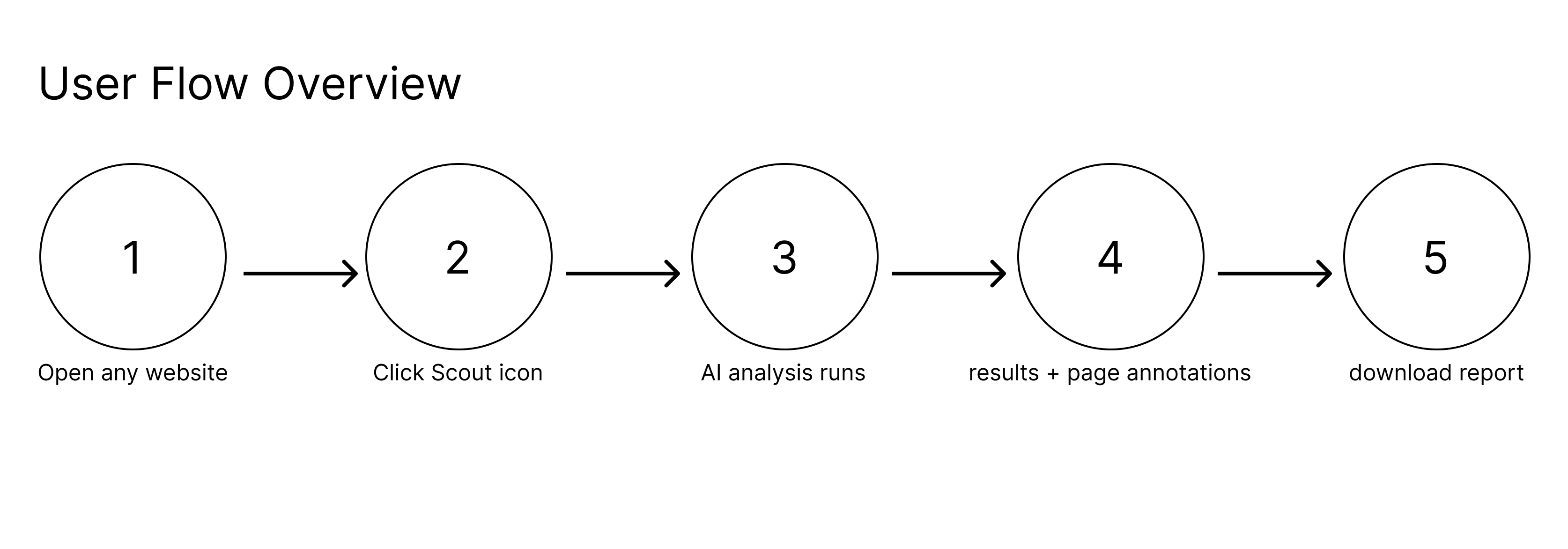
Scout is an incredibly useful Chrome extension for anyone involved in product, UX, or competitive analysis. The ability to analyze a competitor’s website and instantly generate a structured UX intelligence report is a huge time-saver.

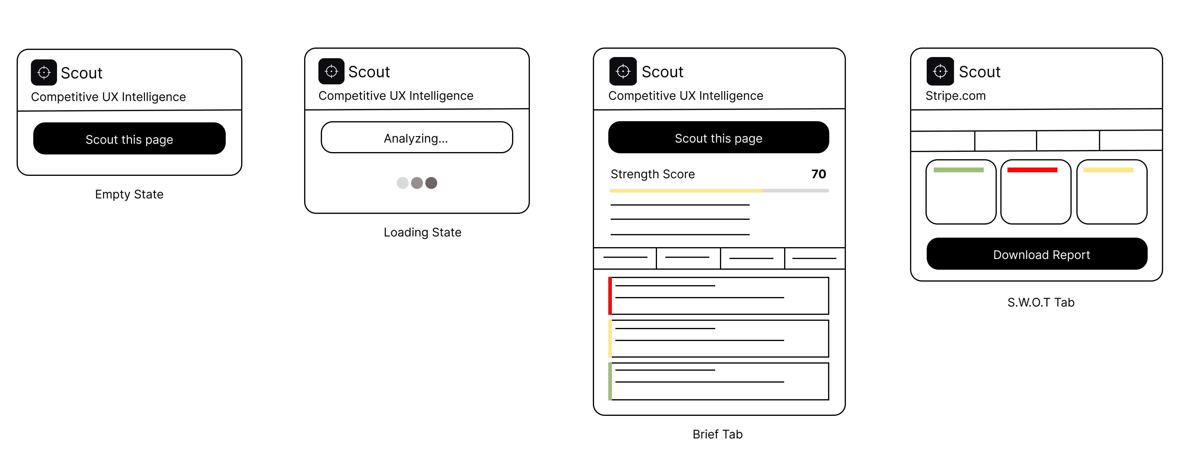
What stands out is how comprehensive the insights are right from strength scoring based on real UX signals to clearly articulated target audience, value proposition, and even emotional tone. The top strategic takeaways are especially valuable, as they go beyond surface-level observations and highlight actual impact and opportunities.

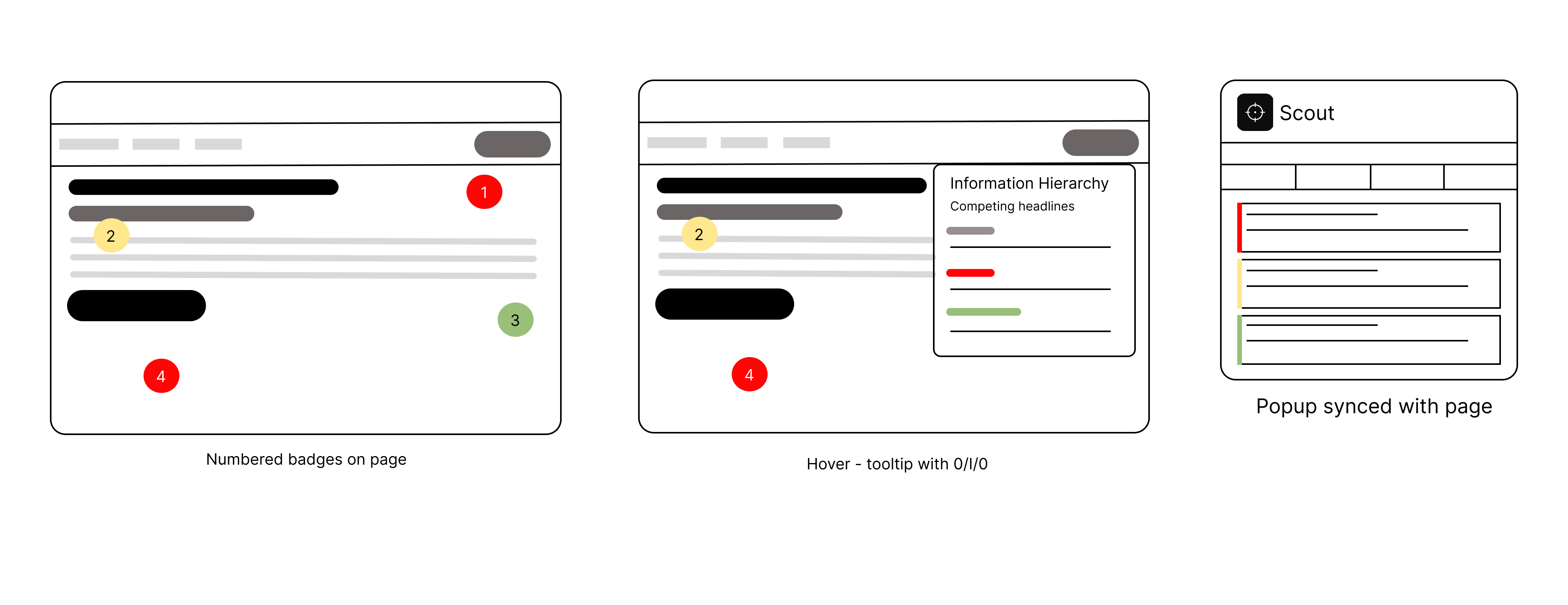
The visual annotations on the page make it very easy to connect insights directly to UI elements, which is something most tools miss. The fact that it also provides a downloadable report makes it practical for sharing with teams and stakeholders.

Overall, it’s a well-thought-out tool with real utility for designers and product managers. Looking forward to seeing how it evolves further.

Reflection

After shipping

You don’t really know a thing until it’s out in the world, not in a deck, but in someone’s browser with a store listing behind it.

What I still stand behind

To me, the AI reads like a designer wrote it. Annotations sit on live pages, not static mocks. I could hand the report to a client without apologizing for it. And this isn’t a concept reel. It’s on the Chrome Web Store, one click to install for anyone who finds it.

What shifted for me

I kept bumping into the same truth: framing mattered more than any single feature. Calling it “competitive intelligence” instead of a “UX audit” changed how the product felt, and how I talked about it. Progressive disclosure was the difference between drowning people and inviting them in. And building with tools like Cursor changed my sense of what I could ship alone: I went from idea to working extension in about two days. Nothing stuck with me quite like shipping something real, rough edges and all.

If I keep building

The four directions that feel most worth pursuing are multi-page scouting so a full site narrative emerges across homepage, pricing, and onboarding; side-by-side competitor comparison so you can see two products in the same frame; a sharper critique intensity mode for when you want blunt tradeoffs rather than balanced observations; and saved report history so analysis compounds over time rather than disappearing after each session. Each of these came directly from hitting the edges of what Scout can do right now.

Get Scout on the Chrome Web Store →