Map first, readable in seconds
Stress-first entry
Under stress, the map carries the first read of the area: no hero walls or intros before context.
This UX research case study covers geospatial safety and community-sourced intel. Mixed methods in Bangalore and at scale (n=1,247 survey; 45 interviews) grounded map-first IA, temporal filters, and peer trust signals.
Fieldwork through benchmarks, synthesis, triangulation with ship metrics, and usability under stress. The annotated UI lives in the product case study, while this page stays on the research thread.
Full product case study Visit safeyelli.inSafeYelli is an information website that empowers women to navigate urban India safely through real-time incident reporting, interactive heat mapping, and community-verified safety intelligence.
In urban India, millions of women navigate a hidden map of fear: streets that read safe by day shift at night, and efficiency-first navigation rarely encodes time, trust, or peer signal. The research program combined interviews across Bangalore, a 1,247-response survey, contextual inquiry, diary studies, geospatial analysis, and usability, then surfaced the constraints that made map-first, temporal, community-grounded IA the obvious bet.
Mixed methods across the behavioral ↔ attitudinal and qualitative ↔ quantitative grid: depth in Bangalore, scale online, geospatial context, then rigorous synthesis, member checking, and triangulation with the survey before usability hardened the shipped IA.
Each method is placed on a behavioral ↔ attitudinal and qualitative ↔ quantitative grid. Hover or focus a point for counts and how it was used.
45 semi-structured interviews (45–60 min) with women in Bangalore on daily safety, coping, and map gaps. Recorded, transcribed, thematically coded.
1,247 complete responses; 78% completion rate; 35 tracked data points. Validated qual findings and quantified priorities, demographics, and incident frequency.
28 observation/shadowing sessions on real commutes (morning & evening; transit & streets) to capture decision-making and environmental cues.
15,000+ incident-related data points over 2 years; 450+ neighborhoods mapped for patterns and risk zones.
6 sessions (8–10 people each, ~90 min) to validate personas, compare experiences, and co-create feature directions.
15 participants logged routes, incidents, and emotional responses over 14 days (320+ entries) via mobile diary.
Synthesis & validation: affinity mapping with two independent coders, 23 → 5 consolidated themes, 12 participants in member checking, triangulation with the quantitative file (n≈1,247), then multi-round usability on map exploration and reporting under time pressure.
Mixed-methods map (same coverage as a behavioral × attitudinal / qualitative × quantitative frame): Qualitative + attitudinal relied on in-depth interviews, focus groups, and diary studies. Qualitative + behavioral relied on contextual inquiry and shadowing on real commutes. Quantitative + attitudinal relied on the national online survey. Quantitative + behavioral relied on geospatial incident and pattern analysis. Together they cover what people say, what they do, and how often patterns show up at scale.
Women moving through Indian cities plan around a layer that doesn't exist on Google: which streets feel safe right now, for someone like them, at this hour.
Official crime data is sparse, delayed, and disconnected from what people ask before they leave the house or the office: “Is this route worth it tonight?” Navigation products optimize for minutes and meters; they don't encode the temporal, social reality of moving through public space as a woman. That gap shows up as changed plans, longer commutes, cab spend, and check-ins with family, and it lands as a hidden tax on mobility and peace of mind.
Women in urban India face daily safety concerns in public space, especially after dark. Existing tools lacked comprehensive geospatial, community-verified intelligence; the research (interviews in Bangalore + national survey n=1,247) made that gap measurable and actionable.
The online survey ran across social ads, women's safety communities, universities, and workplace networks. After quality filters, n=1,247 complete responses supported significance testing (95% confidence, ±2.8% margin of error). Bars below mirror headline items; tables capture demographics, incident cadence, and the gap between features people want and what existing tools offer.
12 major metros represented; 73% working professionals.
74% experienced safety concerns at least monthly, which reads as widespread need for better tooling.
Respondents rated how much they wanted each capability versus whether they had it today. Large gaps signal where SafeYelli could differentiate.
| Feature | % want | % have now |
|---|---|---|
| Emergency SOS | 96% | 45% |
| Real-time safety map | 94% | 12% |
| Route safety scores | 91% | 8% |
| Safe route suggestions | 89% | 5% |
| Community reports | 88% | 15% |
| Time-based alerts | 82% | 10% |
| Peer reviews | 76% | 18% |
Market opportunity: Emergency SOS is the most “available” capability yet still sits 51 points below stated demand. Real-time mapping and route scoring show 80%+ gaps, which marks the core space for a community-grounded, map-first product.
First three months after launch, aligned with the executive summary snapshot.
Post-launch survey and usage patterns sit below; each row animates on scroll, same as the outcome section.
89% of users report feeling safer when navigating with SafeYelli.
78% weekly geomapping usage, the most engaged feature across segments when the map/reporting loop is live.
92% task completion for safety-related tasks and reporting (unaided where possible).
71% choose safer routes even when they take longer if the product surfaces tradeoffs clearly.
Additional benchmarks from the same instrument read best alongside qualitative themes in Key insights.
Feel unsafe walking alone after 8 PM; peak window 8–11 PM in time-series review.
Average additional commute time women budget to feel safe; many reported 15–90 minutes daily across modes.
Use Google Maps but want integrated safety context, which reflects high existing behavior to extend rather than replace.
Trust peer and community reviews over distant official statistics because those voices read as more current and relevant.
Would share anonymous location-linked data for community safety if privacy is explicit.
Would subscribe for premium safety features; stated anchor around ₹199/month for peace of mind.
The survey ran across social ads, women's safety communities, universities, and workplace networks. After removing 287 incomplete or low-quality responses, n=1,247 completes remained. 95% confidence level, ±2.8% margin of error. Demographics cross-checked against census data where available.
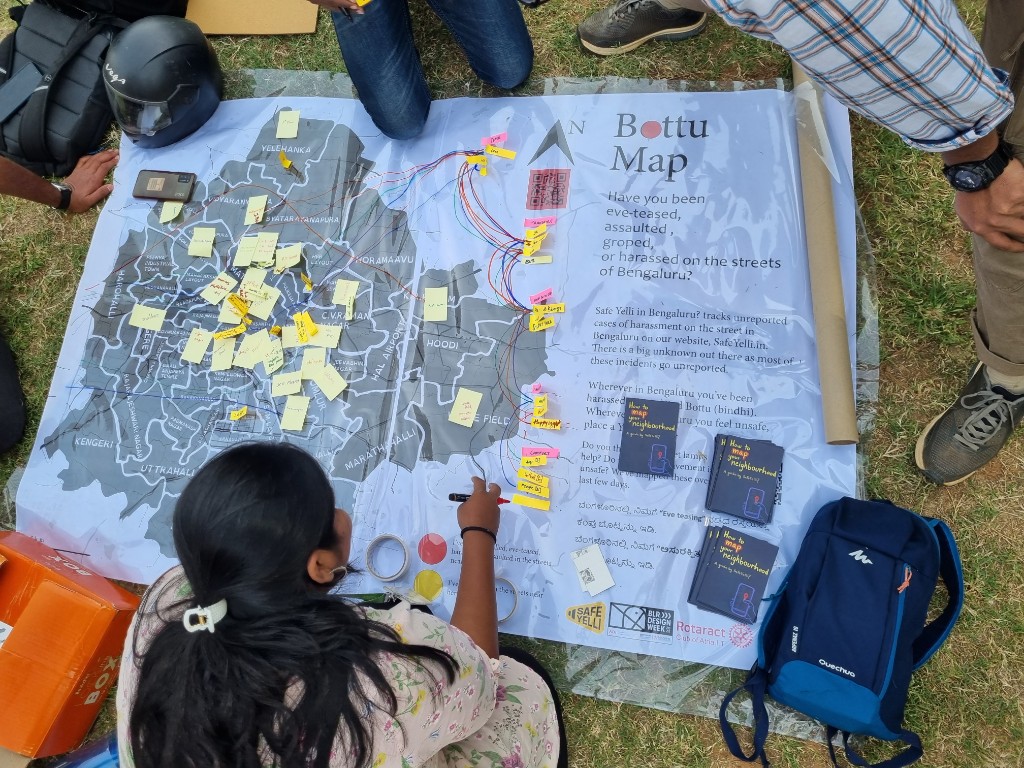
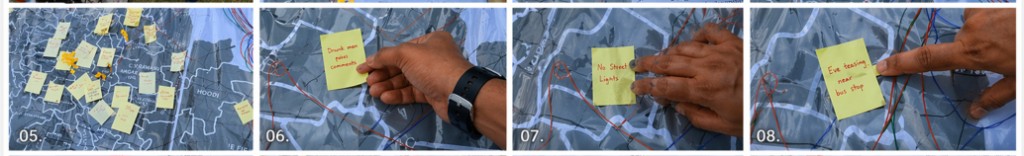
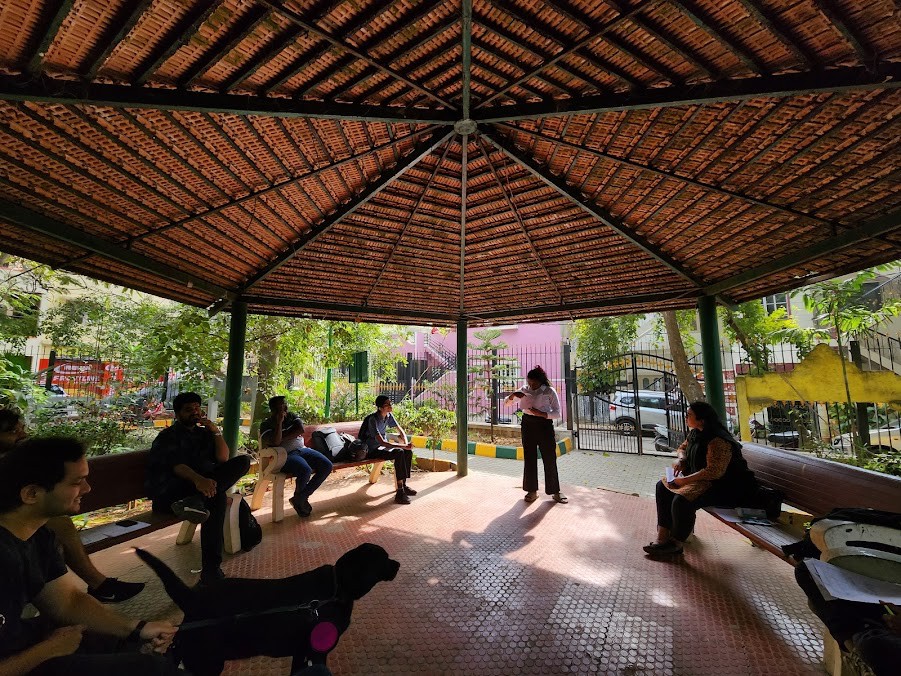
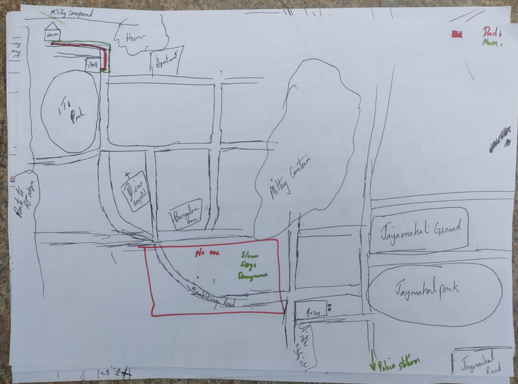
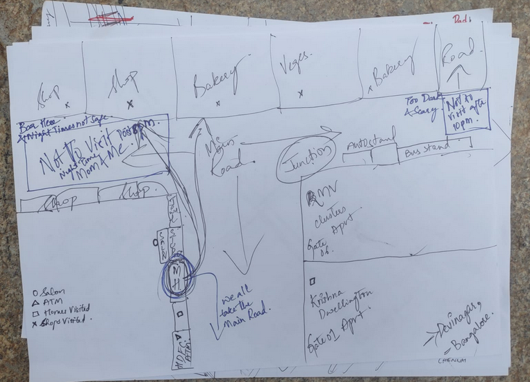
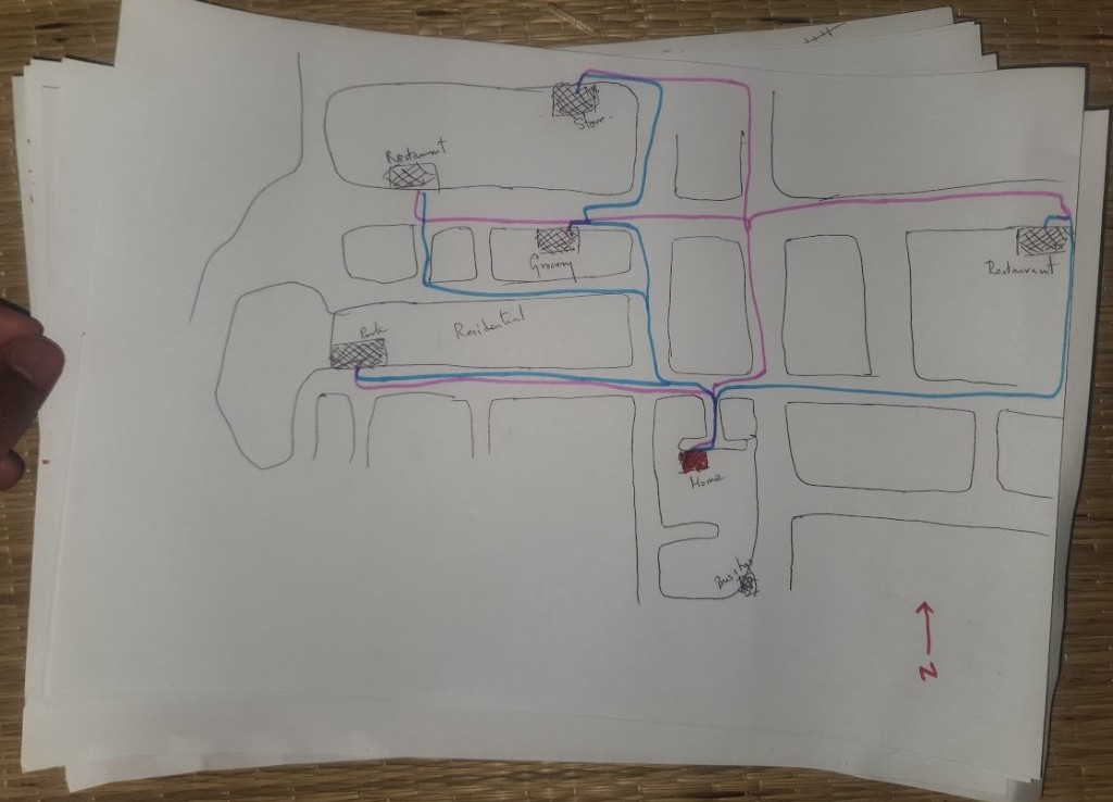
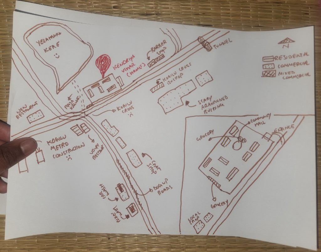
A collection of maps drawn by participants at community events in Hebbala and Yelahanka. Participants were asked to sketch their neighbourhoods and mark frequent travel destinations. They were then asked to trace routes that family members take to the same points, followed by a discussion of why those routes differ. Recurring themes included stray dogs, lighting, theft, cultural norms about who travels with whom, and walking alone versus with others.
Everyone took turns narrating how routes shifted depending on who was walking, when, and where. Girlfriends were accompanied from far away. Police had asked people to turn away from certain stretches because robberies were high, with men drinking often congregated on the street outside a women's PG.
Every map was a study of many families, spaces, genders, and streets. From that work we ended up mapping over 150 street lamps, 100 trees, and 100+ more points of interest.
We traveled across Bangalore for interviews and contextual inquiry, then scaled patterns with a national survey that asked the same question everywhere: whether a route would feel acceptable for someone like them, at that hour. Speed and distance alone never answered it. The gap between sparse official data and that lived decision was the real design problem.
I set out to hold community-grounded reporting on a map people already know how to read, without turning pain into spectacle. I wasn't trying to replace judgment with charts; I wanted peer signal, time, and place clear enough that safer planning felt possible. What kept surfacing in interviews, diaries, and the quantitative file became the backbone of information architecture and the map-first experience, from first load through reporting back.
The problem wasn't “no safety app.” It was that the products people already use for directions treat safety as out of scope.
A street can be fast and well lit on the map and still feel hostile after dark. Users weren't asking for more charts; they needed lived, time-aware, place-based intelligence that matched how fear actually shows up in a week, not how crime is filed on a form.
Across interviews and a broad survey, the same pattern held: people constantly adapt routes, timing, and mode using informal knowledge and word of mouth. When that breaks down (new city, new job, late night), they improvise. Existing tools optimized for efficiency, not for the temporal, social reality of moving through public space as a woman.
Navigation apps don't surface safety; people fall back on gut feel or stale word-of-mouth.
Intel scattered across WhatsApp, friends, and personal memory, leaving no trusted central layer on the map.
Jobs, housing, and social life constrained by safety, and the tradeoffs are expensive and persistent.
Constant hyper-vigilance drove stress and anxiety; several participants cited therapy linked to commute fear.
Forty-five in-depth interviews, diary studies, and n=1,247 survey responses converged on the same constraints. Those were not nice-to-haves but gates for IA and UI.
Mental exhaustion from being “always on alert” in public space.
Choosing lit, crowded routes even when they add time.
WhatsApp and informal networks carry safety intel without a shared map layer.
Privacy fears about location tracking and misuse tempered willingness to adopt tools.
The same place reads safe or unsafe depending on hour and context, so temporal risk had to be first-class in the product model.
“Google Maps shows the fastest route, not the safest. I've memorized streets to avoid after dark.”
“We share safety info in WhatsApp groups. Imagine tapping into thousands of women's experiences.”
“I changed jobs because my 9 PM commute felt risky. Safety literally costs me money every month.”
In interviews, the same streets and crossings read completely differently at 4 PM vs 10 PM. 83% already changed routes or timing weekly for safety, so time of day had to be first-class and easy to act on, not buried in settings.
67% preferred community-verified, recent, local signal to distant official stats; distant authority felt cold on the street. The product had to read as collective sensemaking, not a top-down dashboard.
Those patterns plus the survey benchmarks (problem framing and survey charts & metrics) pointed to one move: a citizen-powered safety layer on the city with reporting, verification, map exploration, and privacy in the core offer, not bolted on after.
Sessions were recorded and transcribed verbatim. Two independent coders ran affinity mapping, collapsing 23 codes into 5 themes. Twelve participants validated findings through member checking, and themes were triangulated against the n=1,247 survey. Follow-up probes were conducted in English, Hindi, or Kannada per participant preference.
Temporal safety and peer trust were research inputs; four checks gated layout, flow, and defaults before build, each traceable to interview and survey patterns below.
Framework
Each principle is a decision gate: orientation, time and place in filters, trust on the map, reporting that protects the sharer, not polish.
Design opportunities from synthesis: (1) integrate safety into familiar navigation rather than replacing it; (2) formalize community-powered intelligence participants already share informally; (3) make time-of-day a first-class input in scores and filters; (4) lead with privacy-first architecture built on anonymous reporting, optional precision, and transparent use of data so we could unlock the 92% willing to contribute when trust is clear.
Stress-first entry
Under stress, the map carries the first read of the area: no hero walls or intros before context.
Match the research
Same street, different hour, different risk. Filters lead with when and where, not a buried category list.
Plain language, visible provenance
Say how corroboration works: recency, locality, uncertainty, so people can trust or challenge the map, not a black box.
Reporting that feels safe
Anonymity and precision control mattered for willingness to report; the flow had to feel emotionally safe before tech privacy could help.
Research-driven IA and flows translated into measurable adoption and confidence: the same temporal, peer-trust, and privacy-sensitive model we saw in interviews and the n=1,247 survey showed up in usage, completion, and self-reported safety after launch.
The biggest surprise was that community trust didn't come from the product. It came from showing up in person. The grassroots mapping sessions built credibility that no interface decision could have. That taught me design is only part of the system.
If I started again, I'd define success metrics with the team before launch, not after. Leaving without clear measurement in place meant the product's real impact was always harder to prove than it deserved to be.