SafeYelli
SafeYelli is an information website that empowers women to navigate urban India safely through real-time incident reporting, interactive heat mapping, and community-verified safety intelligence.
The narrative below ties research to product decisions, but the spine of the work is design: a map-led, responsive experience that turns community signals into something people can read and act on quickly.
Research case study Visit safeyelli.inA map that doesn't answer the real question
Women moving through Indian cities plan around a layer that doesn't exist on Google: which streets feel safe right now, for someone like them, at this hour.
Official crime data is sparse, delayed, and disconnected from what people actually ask before they leave the house. That gap shows up as changed plans, longer commutes, money spent on cabs, and a hidden tax on mobility and peace of mind.
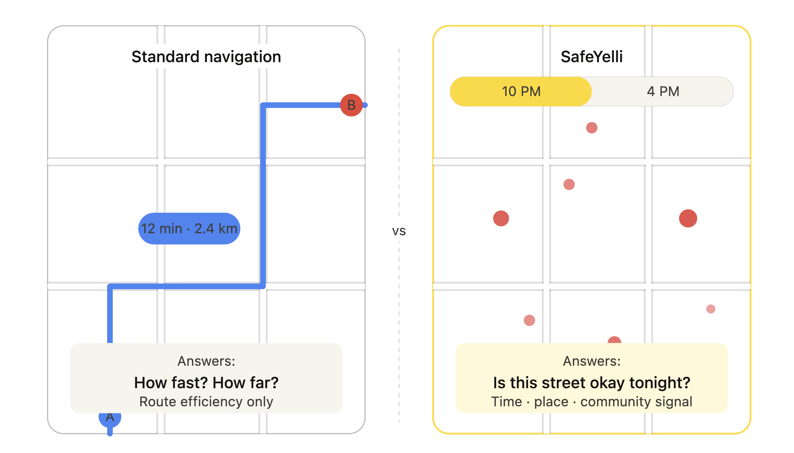
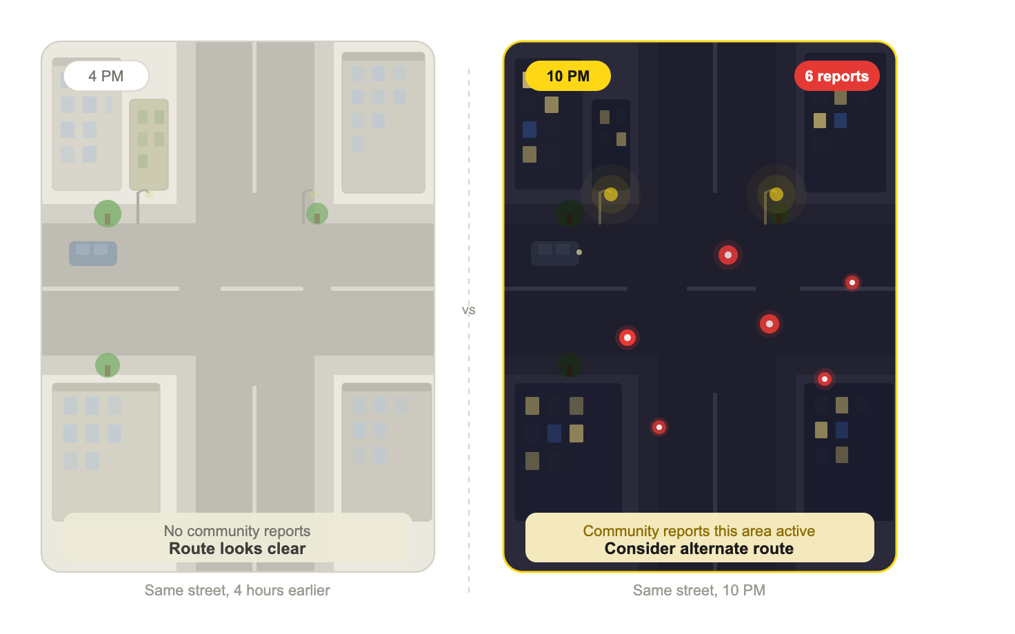
Maps answer minutes and meters, not whether a street feels okay tonight.
I kept hearing a question that speed and distance alone never answer: whether a route would feel acceptable for someone like them, at that hour. The gap between sparse official data and that lived decision was the real design problem. I wanted peer signal, time, and place clear enough that safer planning felt possible, on a map people already know how to read, without turning pain into spectacle. What surfaced in interviews and survey work became the backbone of the map-first experience, from first load through reporting back.
Navigation tools ignore time and trust
The problem wasn't “no safety app.” It was that the products people already use for directions treat safety as out of scope.
A street can be fast and well lit on the map and still feel hostile after dark. Users weren't asking for more charts; they needed lived, time-aware, place-based intelligence that matched how fear actually shows up in a week, not how crime is filed on a form.
Two findings that reframed the product
Interviews, survey write-ins, and headline stats from the same study. After synthesis, not nice-to-haves: constraints the design had to obey.
Safety is temporal
In interviews, the same streets and crossings read completely differently at 4 PM vs 10 PM. 83% already changed routes or timing weekly for safety, so time of day had to be first-class and easy to act on, not buried in settings.
Trust flows from peers
67% preferred community-verified, recent, local signal to distant official stats; distant authority felt cold on the street. The product had to read as collective sensemaking, not a top-down dashboard.
Those patterns plus the survey benchmarks above pointed to one move: a citizen-powered safety layer on the city with reporting, verification, map exploration, and privacy in the core offer, not bolted on after.
How the three loops connect
The IA was built around three distinct user modes named explore, report, and act, each with its own entry point and flow, but all feeding back into the same live map layer. This loop structure meant every report made the product more useful for the next person.
A system, not a single screen
SafeYelli connects three loops: see what's happening on the map, report so the map stays alive and local, and act with flows that support planning and urgency.
The site is the public face of that system: map-led layout, filters that match how people talk about risk (when, where, what happened), and IA tested so emergency-oriented paths stay discoverable while the rest stays scannable.
Map & exploration
Hover the pins on the video for detail, or tap on mobile.
Reporting
Anonymous incident reporting so the map stays current without asking people to over-expose themselves.
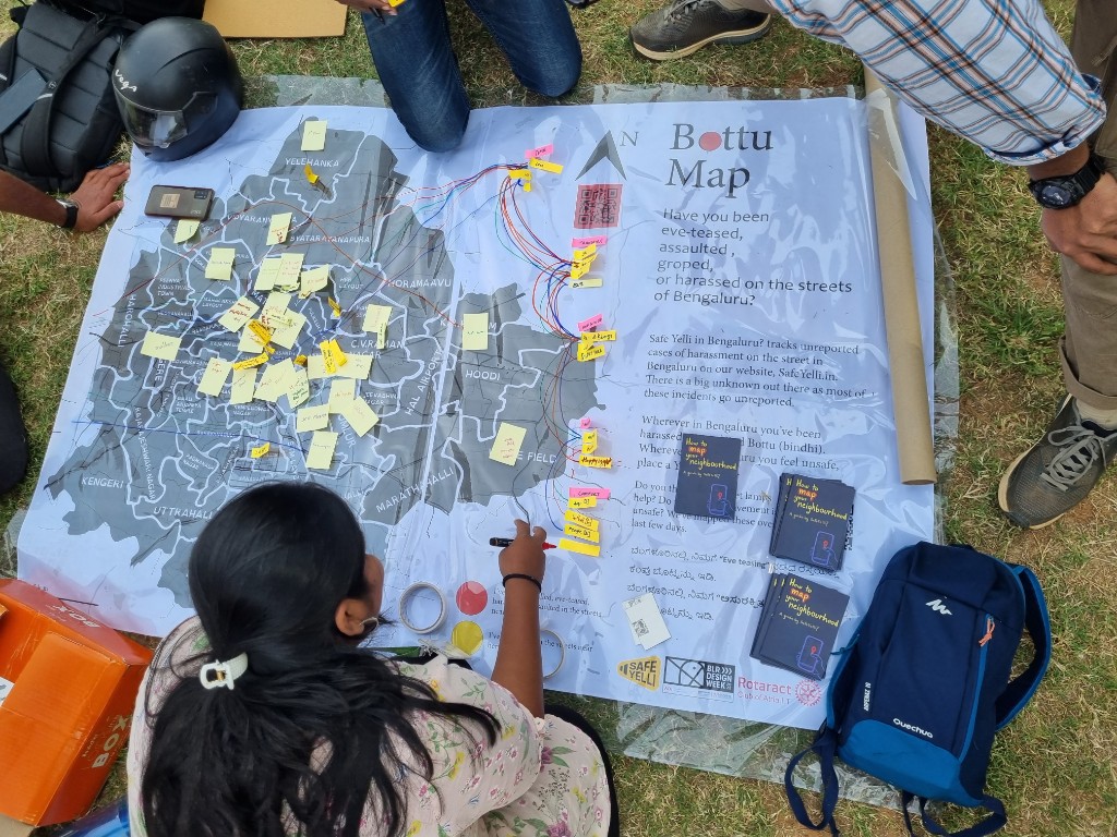
Community on the ground
Neighborhood mapping initiatives validated the crowdsourced model and deepened trust.
What changed
Validation showed the mental model stuck: strong task success, faster flows after IA work, and real adoption as proof that temporal, community-first safety tooling was the right bet.
What we learned from testing
- Users oriented to the map immediately without instruction.
- The time-of-day filter was the most-used feature after launch.
- Anonymous reporting removed the biggest barrier to submission. Participants said they wouldn't have reported otherwise.
The biggest surprise was that community trust didn't come from the product. It came from showing up in person. The grassroots mapping sessions built credibility that no interface decision could have. That taught me design is only part of the system.
If I started again, I'd define success metrics with the team before launch, not after. Leaving without clear measurement in place meant the product's real impact was always harder to prove than it deserved to be.