Features
02
What I tested
Five features.
Before · V1
After · V2
An AI-powered note-taking app designed to help students write, refine, and study their notes more effectively, with intelligence woven throughout the entire workflow.
The interactive demo reflects the version evaluated during user testing. A redesigned iteration is currently in active development.
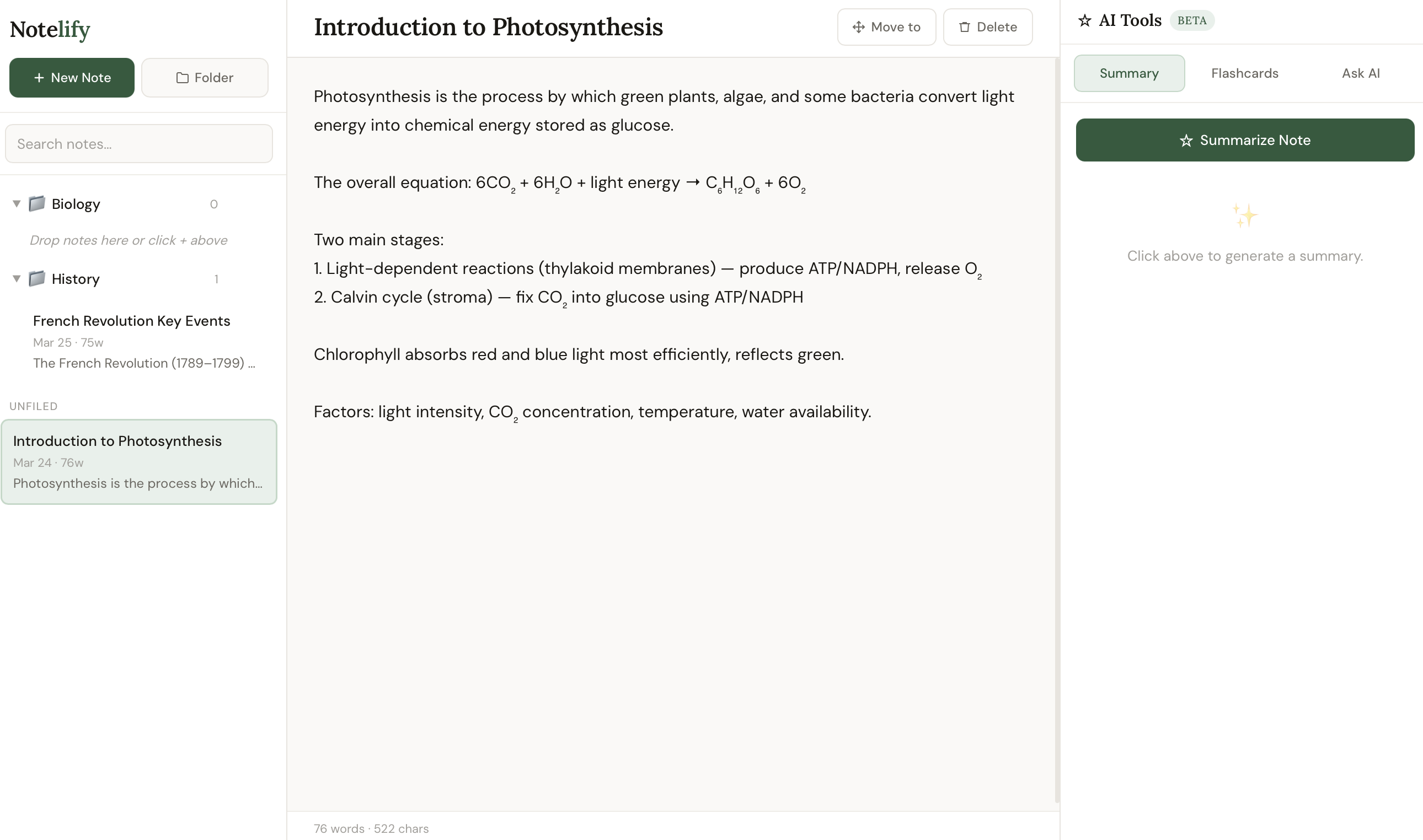
Most digital note tools are just storage. Notelify is built on the idea that reviewing and refining notes is the studying, and AI should be woven throughout, not bolted on.
The Problem
This started as a personal observation, not a research brief. I was the user -- someone who wrote pages of notes and rarely opened them again before an exam. I wanted to know if that pattern was broader, so before sketching anything, I sat with a small group of students and asked them how they actually study. Not how they think they should, but what really happens. What I heard confirmed the pattern: the problem was not writing notes, it was never returning to them.
Most digital note tools treat notes as an archive, you write them, file them, and rarely return. I kept seeing this pattern in how students studied, and it felt like a solvable design problem.
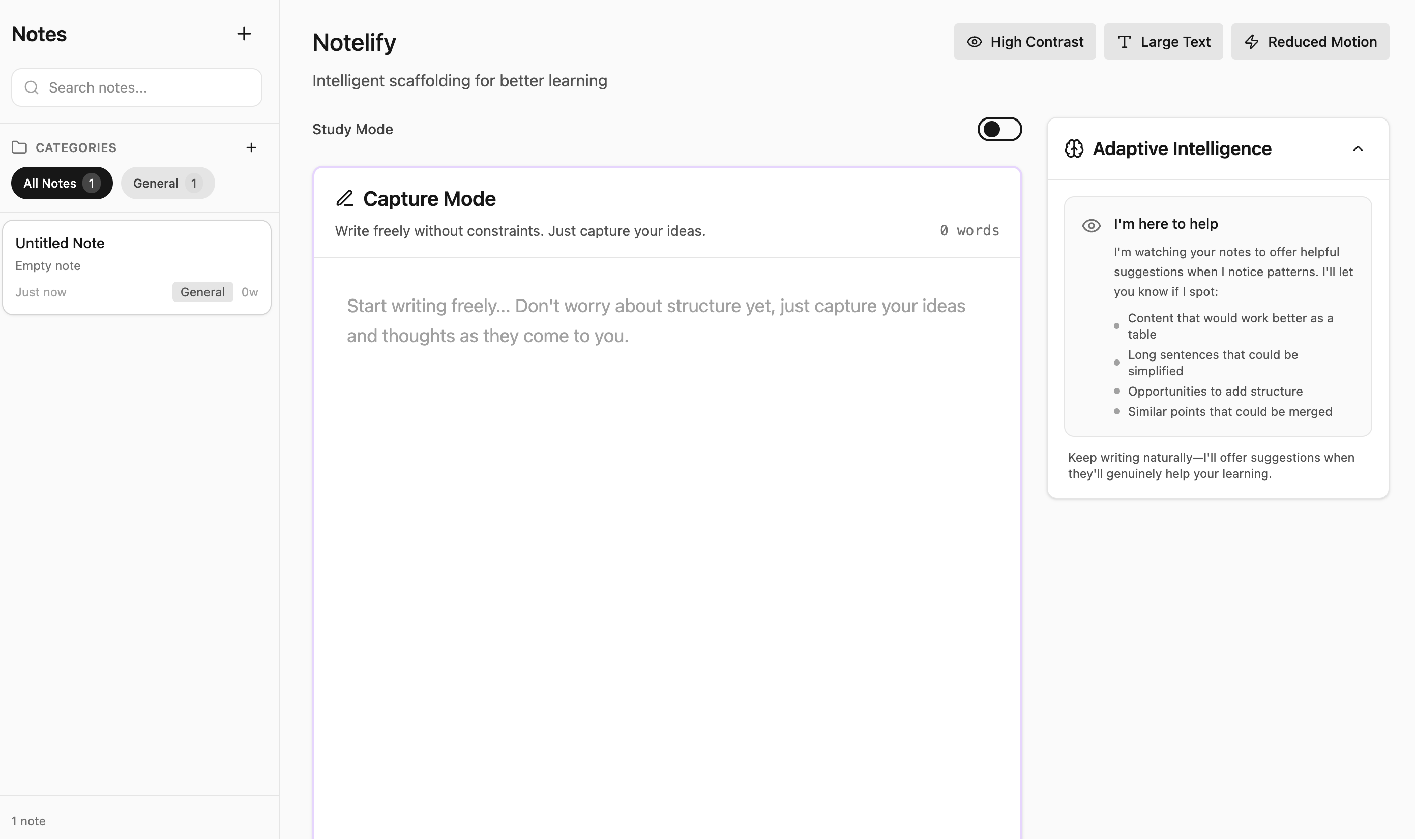
I wanted to design a system where AI doesn't replace thinking, it scaffolds it. My goal was to let students write notes the way they always do, but have the tool surface gaps, generate recall prompts, and adapt to what they struggle with most.
I started with user research, mapped the patterns across participants, and let those insights drive every design decision, from the two-mode structure to how adaptive prioritization works.
The Process
I started where I always do, with people. Before sketching a single screen, I sat with students and asked them how they actually study. Not how they think they should, but what really happens at 11pm before an exam. Sauhee and I worked through every stage together -- the research, the wireframes, and the design decisions that followed from testing.
What I heard was consistent: notes get written and abandoned. The gap wasn't in the writing, it was in the returning. That single insight shaped everything that followed.
From there I moved fast, sketching flows, building wireframes, stress-testing assumptions with users, and iterating in tight loops. The five-day sprint forced clarity. There was no room for indecision, only for listening and making.
Every version was tested before changes : aligning the tool with how students naturally capture ideas, then study from them.
What I tested
Five features.
Why Testing
Designing the features felt good. But feeling good about a design is not the same as knowing it works.
The most dangerous moment in any design process is when you've convinced yourself. That's exactly when you need to hand it to someone with no idea what you were thinking, and watch what happens.
So I took the prototype to five participants with a think-aloud protocol. I wasn't looking for validation. I was looking for the moments where the design broke, because those are the moments that move the work forward.
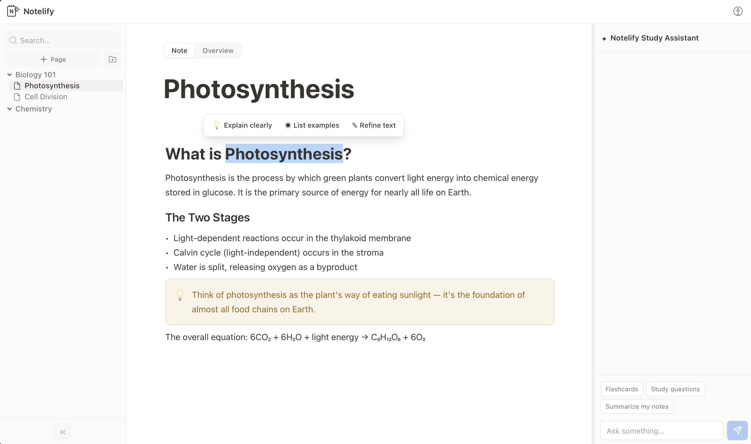
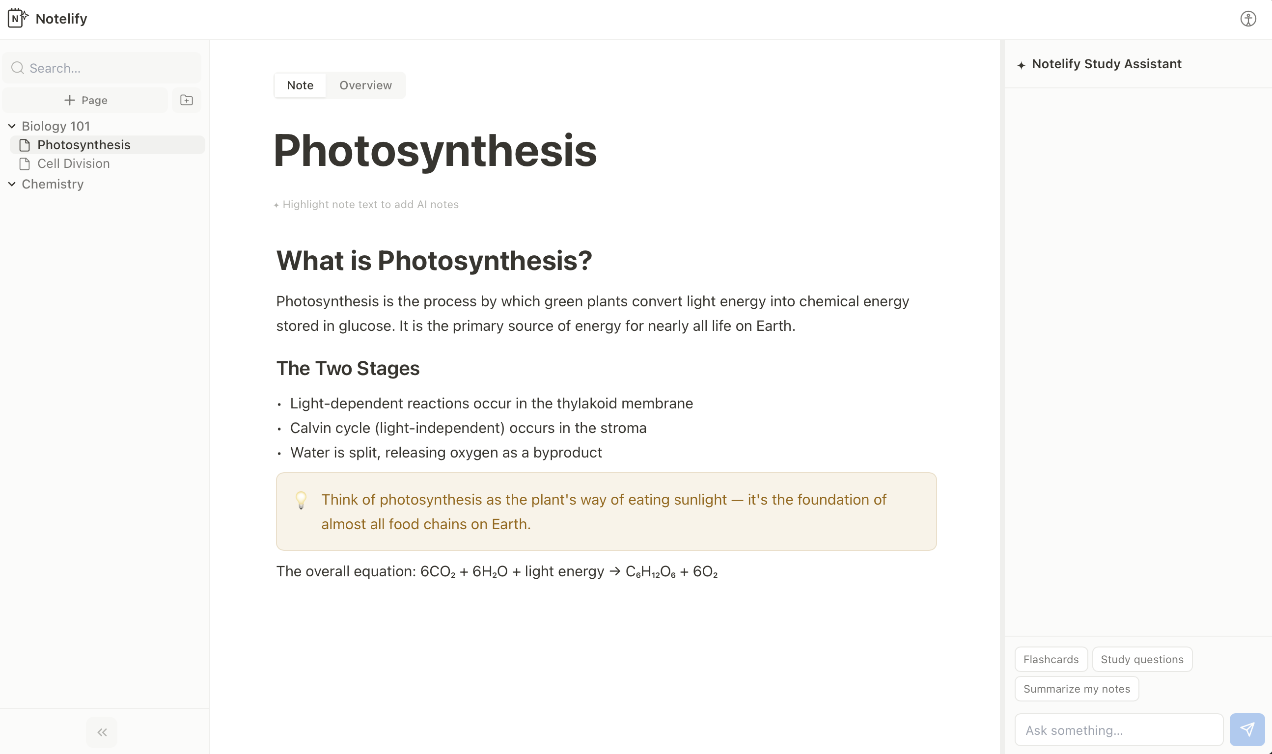
"Being able to ask questions or clarify concepts during note-taking would make the system more useful in real time, not just when studying."
First exploration of the two-mode structure. Established Note Mode and Overview Mode as the core interaction model.
Notelify was a five-day sprint. But the questions it raised have stayed with me longer than the build itself.
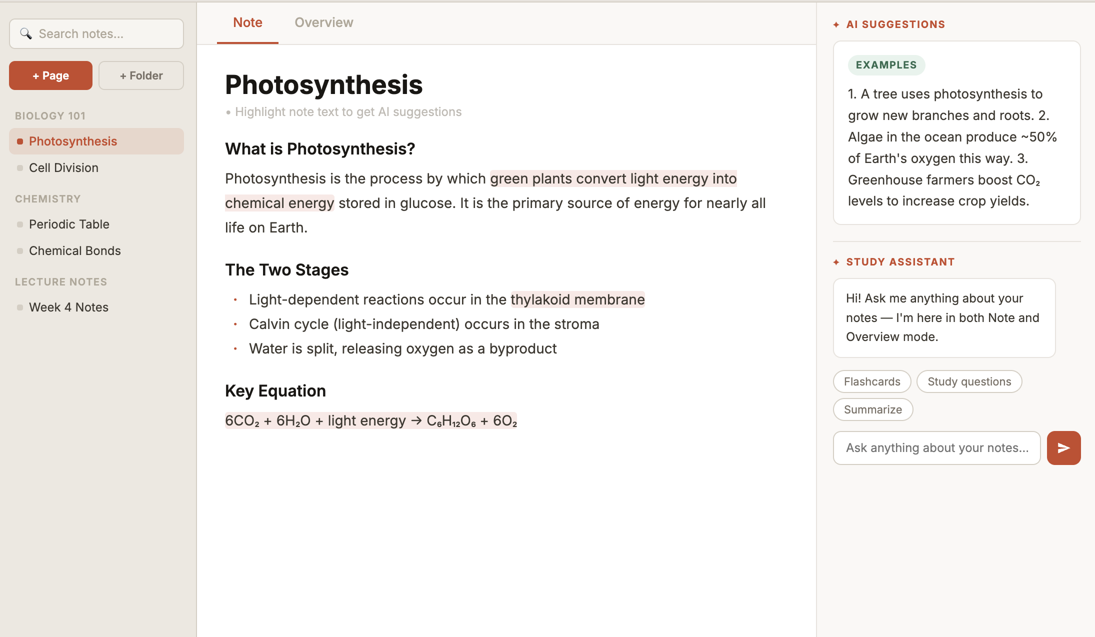
What I kept thinking about after testing: I'd designed features users found useful, but I'd also introduced friction I didn't anticipate. The highlight-to-activate pattern felt obvious to me as the designer. It was invisible to every single participant.
That gap, between designer intuition and user expectation, is where the most valuable design work happens. I left this project with a sharper instinct for where that gap tends to hide.
The results backed that up. In round 3, most participants found and used the highlight-to-trigger AI feature without any prompting -- the interaction that was invisible to everyone in round 1. All 5 participants said the final version felt genuinely useful and was something they would return to. For a five-day sprint, that was the clearest signal the redesign decisions had landed.