Fortune
A productivity app for students with ADHD – building sustainable habits through intelligent scheduling and emotionally aware notifications.
What is Fortune?
Fortune is a mobile scheduling app for university students with ADHD, designed through generative and evaluative research (Nov–Dec 2025) by Kanishka Balaji, Jimmy Huang, Madeleine Iribarren, and Clarisse Pelayo Sicat.
It offers two event creation paths – a manual form for control, and an AI voice assistant for natural language – paired with notifications that tell you what you'll have time for, not what you're running out of.
Semi-structured interviews · Screener surveys · Paper prototype testing · Think-aloud sessions
5 UW students (ages 21–36) identifying with ADHD, across generative and evaluative rounds
UX Research · Interaction Design · Prototyping
Generative: November 2025
Evaluative: December 2025
Students with ADHD aren't disorganized –
they're underserved
We assumed students with ADHD would be disorganized and want more structure. Our participants challenged every one of those ideas.
All 5 were deeply self-aware. The problem wasn't awareness – tools didn't adapt to how they lived. Some defined "productive" as dance class or a nap, not just finishing assignments.
We'd assumed struggles stem from individual failure, not structural factors like sensory overload or social anxiety. Some already had tools they didn't use because they caused guilt. The risk: designing another app that adds pressure instead of relief.
Core insight · Generative research
"Students don't need to be fixed. They need tools that meet them where they are."
What we found about ADHD & productivity
Reframing the
design challenge
Three questions shaped the design phase:
How might we help students access sensory-friendly, focus-supportive environments – wherever they are?
How might we design systems that adapt to students' natural rhythms instead of forcing rigid expectations?
How might we support productivity that values wellbeing and rest as much as academic output?
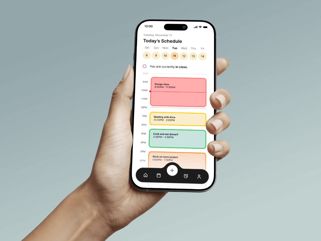
How Fortune works
We mapped two core flows before prototyping: page capabilities (onboarding through alarm management) and notification/task management (how reminders behave after event creation).
- Custom alarm templates (Morning Motivation, Study Grind, etc.)
- AI-suggested reminder messages
- Snooze duration, pre-alarm, auto-dismiss settings
- Notification type (sound, vibration, banner)
- Preview motivational messages
- Log In · Homepage
- Add event → confirm
- Tap event → view/edit/mark complete
- Calendar → search → toggle view
- Alarm manager → presets & settings
- Widget view · Notification pop-up
Components
Core UI components and interaction patterns designed for Fortune, from navigation and scheduling views to notification states and the AI voice interface.
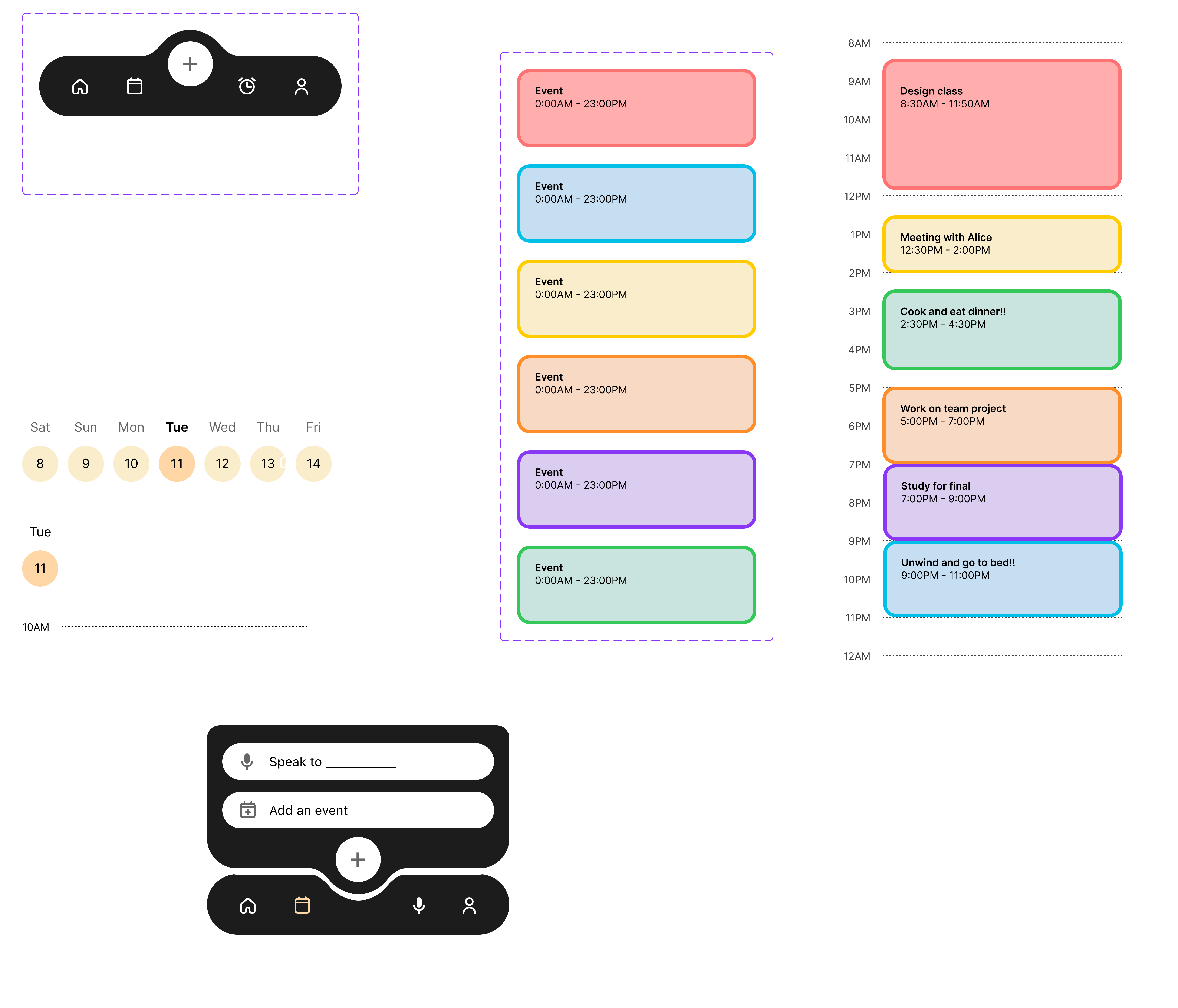
Adding a new event
We designed two distinct paths: a manual form for precision and an AI voice assistant for speed. The AI path was our key design bet – instead of structured fields, you speak naturally and Fortune handles the rest.
Task prompt: "Open the homepage. Show how you would create a new task or event. View the new event on the app homepage."


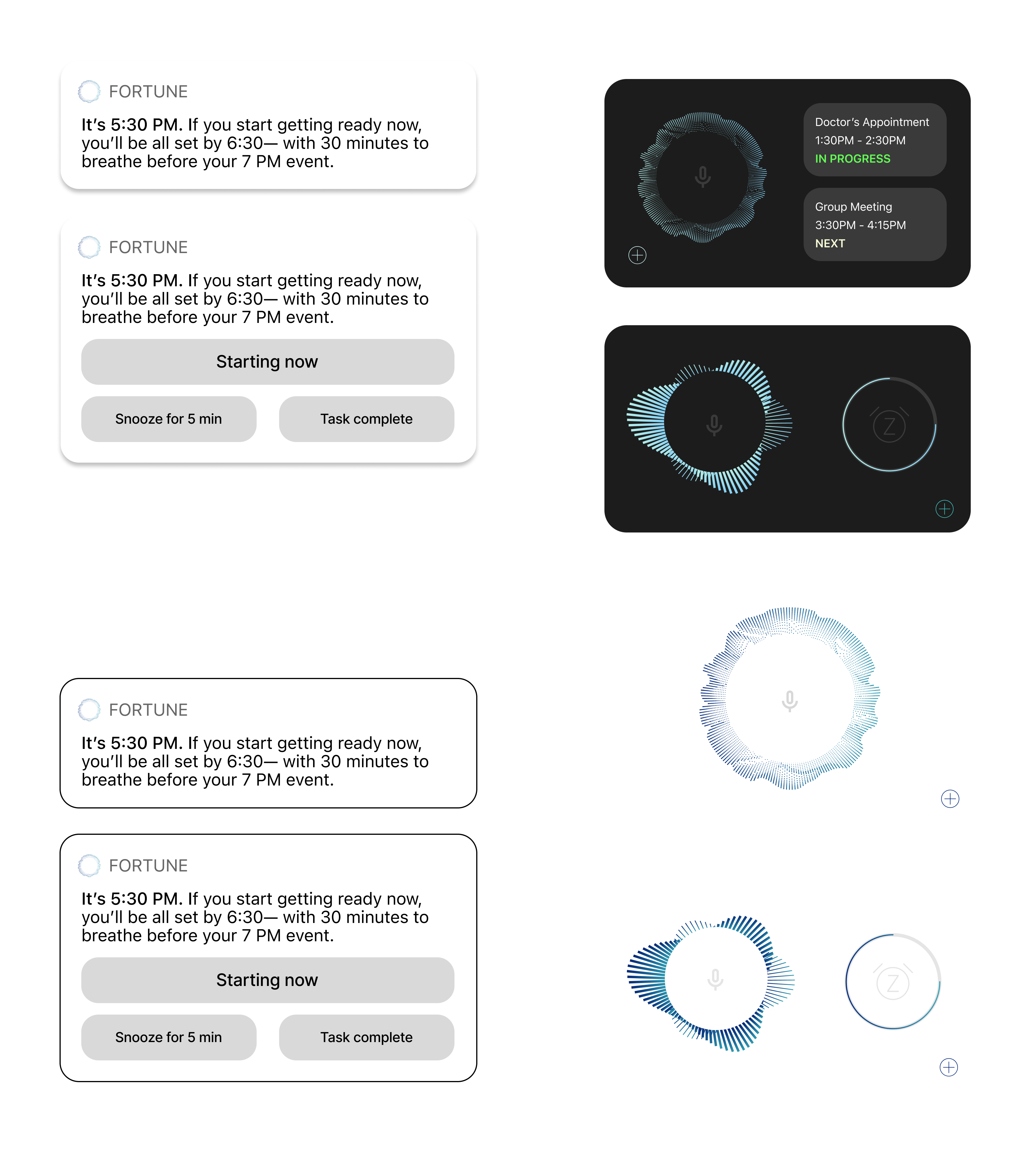
Responding to a reminder
At 5:29PM the lock screen widget shows the assignment starting soon. At 5:30PM Fortune fires a contextual notification – not a generic alert, but a specific message: "If you start now, you'll be all set by 7:30 – with 30 minutes to breathe before your 8PM event."
Task prompt: "The app shows you a notification about an assignment. Show how you would respond: open it, snooze it, ignore it, or mark complete."


Completing a task
Completing a task triggers celebration – confetti, congratulations, and redirection: "Now you have 35 minutes before your Friend's Get Together!" The reward isn't just acknowledgment – it's pointing toward something enjoyable.
Task prompt: "Imagine you finished the assignment. Show how you would mark the task complete. Notice the feedback or 'reward' screen."


What usability testing revealed
Think-aloud sessions with 5 UW graduate students with ADHD. Post-test interviews surfaced emotional responses beyond observed behavior.
View raw dataClear instructions lead to more intuitive experiences
All 5 completed Task 1, but one couldn't find the AI. Teaching needs to be built in from the first session.
"Wanted an onboarding screen to explain what was happening." – P2
Tools need to work with habits, not against them
Automatic notification updates – recalculating based on real behavior – made participants feel understood, not judged.
"It calculates when she'll be done. It's not stressing her out." – P2
Productivity is emotional, not just functional
Tools that reduced shame were rated most helpful, validating the completion reward as a core feature.
"Made me feel like I had accomplished something." – P4
AI task creation beat manual input
Natural language felt significantly lower friction than structured fields. Participants preferred the AI for flexibility.
"The easiest part was the AI task creation feature." – P4
Tone matters as much as functionality
Telling users what time they have – not what they've lost – drove stronger engagement. It felt like a friend, not a judge.
"Feels positive without being pushy." – P5
Where we go from here
Introduce onboarding
A splash-screen overview will help users find the AI – especially important for ADHD users who may not explore unfamiliar interfaces organically.
Clarify text and visual cues
Homepage text and notifications need greater clarity. Visual cues should be formally defined in the design system.
Strengthen interruption design
Explore haptics and other modalities. For students with time blindness, notifications must break through the current activity.
Add shared calendars
Social accountability was a key motivator. One participant requested shared calendars – reinforcing the social dimension of productivity.
Connect email for auto-events
Auto-creating events from syllabi and emails would reduce manual overhead keeping schedules current.
Move to hi-fidelity and retest
Iterate to hi-fidelity, apply feedback, and retest with ADHD-identifying students at UW.