Copart's CashForCars InstaQuote flow lets people get a quote to sell their vehicle in minutes. I led this redesign from research through a stakeholder-approved final flow, working within Copart's Vallejo design system as part of my masters capstone project.
What I did
Led user research, conducted interviews, ran usability tests, and synthesized 25+ FullStory session replays into four core insights
Redesigned the InstaQuote flow, including the damage assessment, photo capture, and offer screens
Presented final designs to stakeholders, including Copart's product team
Context
A 10% completion rate was costing Copart inventory at scale.
Problem
Copart wanted to increase completed sales, and the numbers showed exactly where sellers were dropping off. Out of 275,000 users, only about 10% made it to the final offer screen, and most transactions still needed three to six phone calls to close. An outdated interface with no modern interaction patterns compounded the problem.
9.6%
of 275,000 users reached the final offer screen.
3–6 calls
required per transaction to close the sale.
Outdated UI
no modern interaction patterns.
What we heard
Four themes came out of the research, each backed by what sellers actually said.
Transparency
“When I started looking at these things, I noticed there was a wide price range... how do I know what mine is actually worth?”
Control
“It did not ask me the extent of damage, does it not matter?”
Confidence
“I'd only proceed once payment processes, ownership transfer, and inspection steps are fully clear and documented.”
Emotional acknowledgement
“The system didn't acknowledge the sentimental side of me selling my long-owned car... there was no closure moment beyond the transaction.”
Trust ran through all four. It gets built when a platform feels honest, predictable, and easy to understand, and it breaks the moment pricing feels unclear or a step changes without warning.
The Redesign
Loan status: Moved to the front
Original order
Vehicle Details
Condition
Damage
Loan Status
Revised order
Vehicle Details
Loan Status
Condition
Damage
Cars with an outstanding loan can't be accepted into the program, so asking about it last wasted a seller's time on a car that might never qualify. The redesign moved loan status to the second question in the flow, right after basic vehicle details.
A venue to gain a future customer
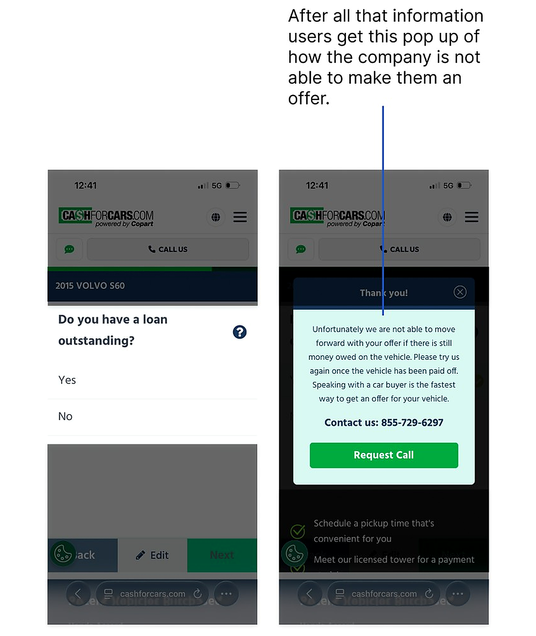
Before
A late loan question ends in a rejection modal that closes the conversation.
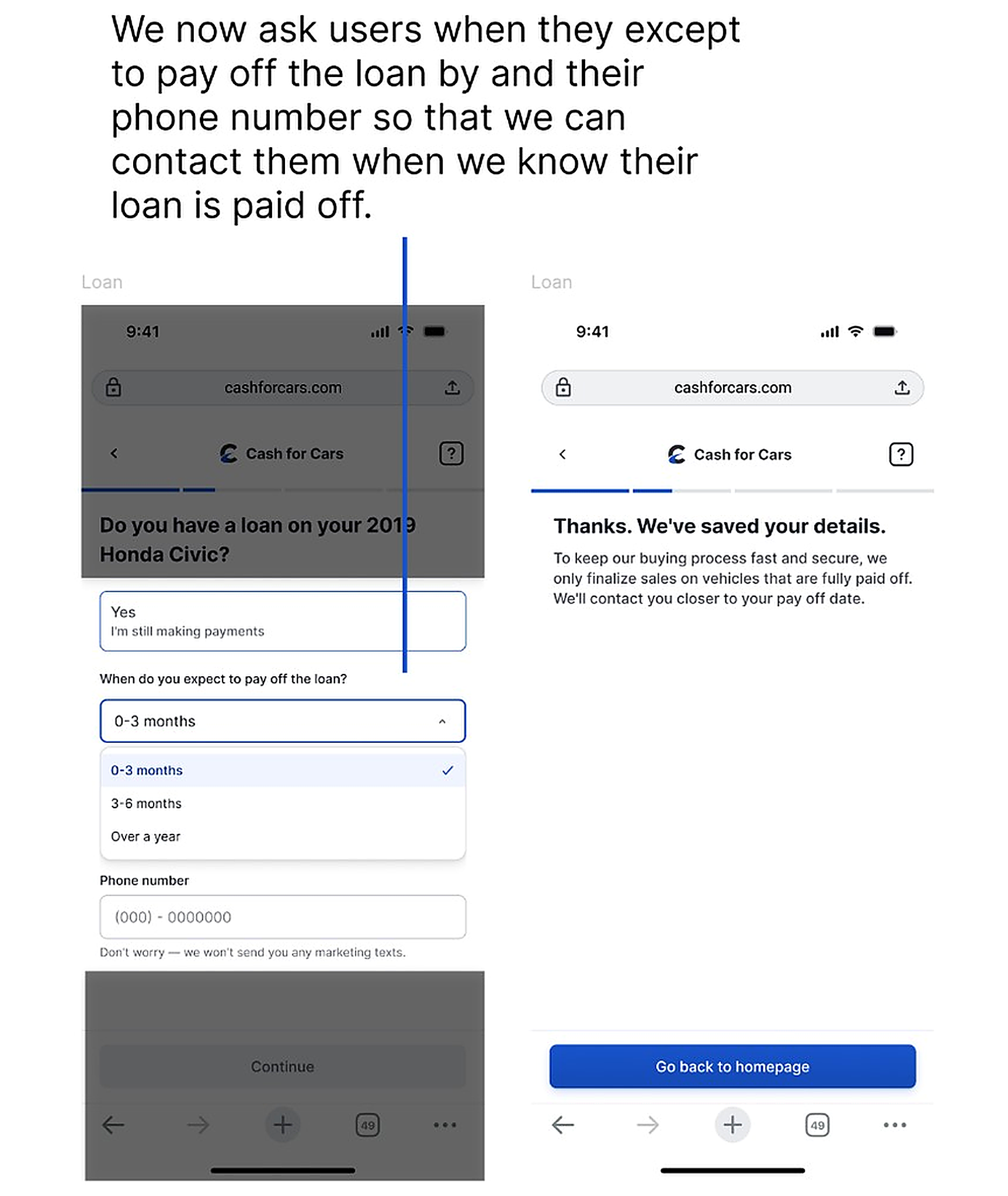
After
Saves the seller's details and keeps the door open for follow-up near payoff.
Personalising the selling process
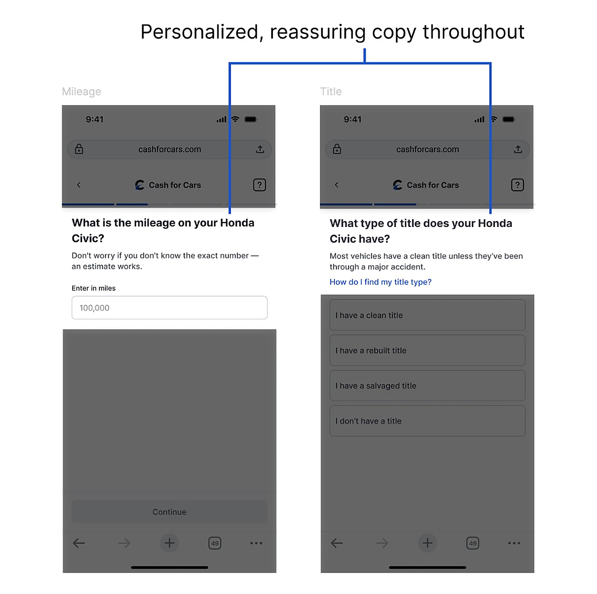
Every question in the redesigned flow uses the seller's actual vehicle name instead of generic phrasing, and small reassurances sit right where sellers need them.
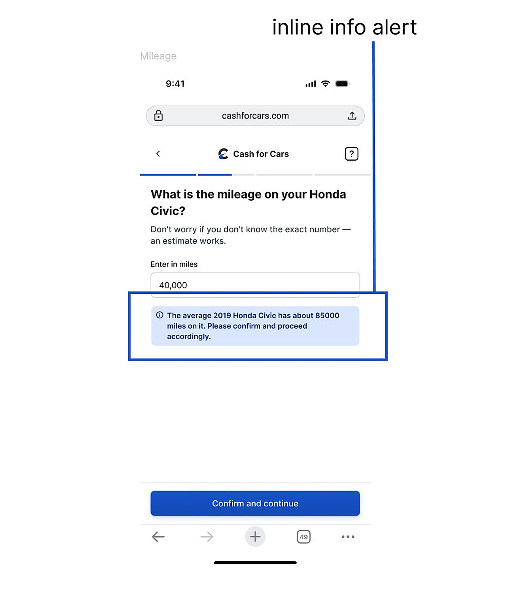
Interruptions replaced with inline guidance
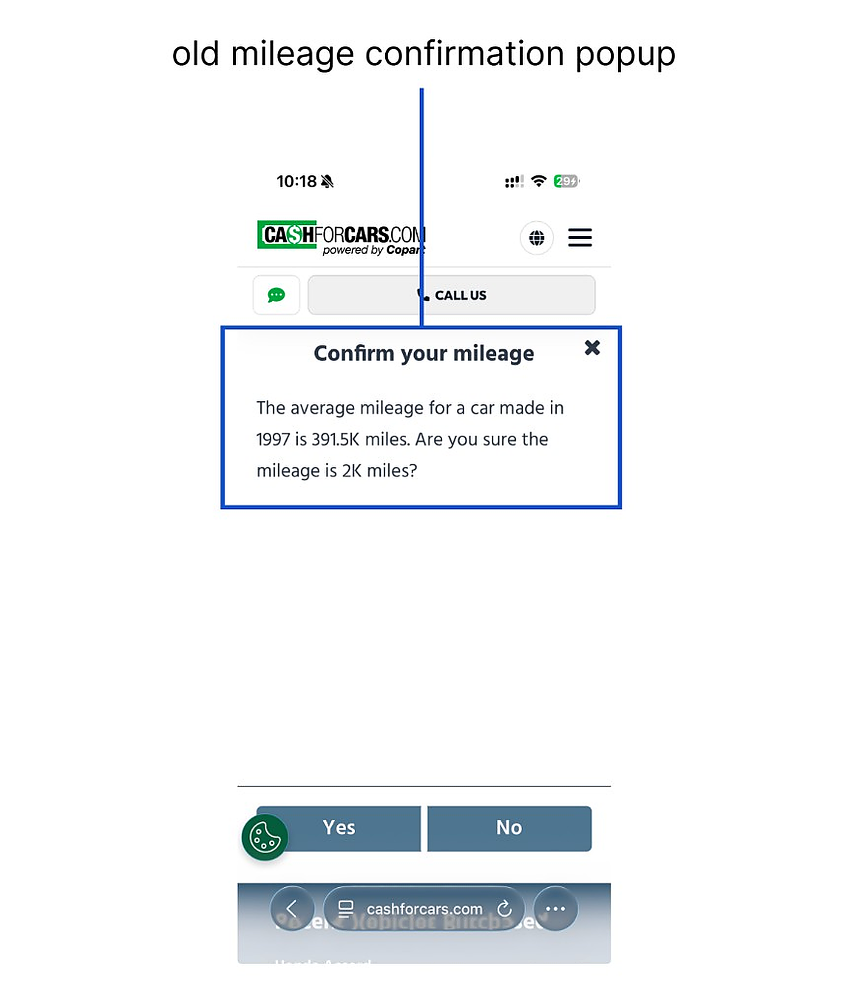
Before
A jarring popup stops the seller and asks them to confirm an unusual mileage entry.
After
An inline alert states the average mileage and asks for confirmation without breaking the flow.
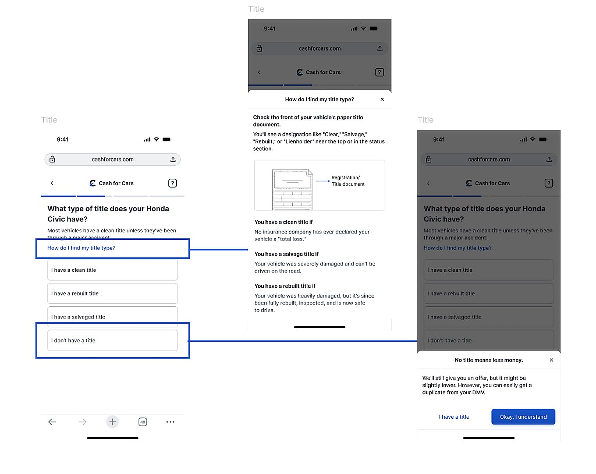
Title question
Sellers who don't know their title type now get a plain-language explainer showing exactly where to look and what each designation means. Sellers without a title at all see an honest heads-up that the offer will likely be lower, along with a suggestion to get a duplicate from the DMV.
During FullStory analysis, we saw that the majority of users were trying to understand what their title type was, but were still getting confused. That pattern shaped how help and plain-language guidance show up at decision points like this.
Plain-language help for title types, plus an honest heads-up when there is no title.
Damage condition question
The redesign has a severity selector with an illustration that updates to show what each damage level actually looks like, a tap-to-mark diagram for damage location, replacing the old flow's single yes-or-no question.
Image upload made guided
Photos moved earlier in the flow, ahead of damage assessment, since Copart's pricing depends on them and asking late meant re-opening the offer later. Sellers can still defer the step with “do it later,” which you saw above and when they do take photos, an on-screen outline guides positioning and shifts from red to yellow to green as alignment improves.